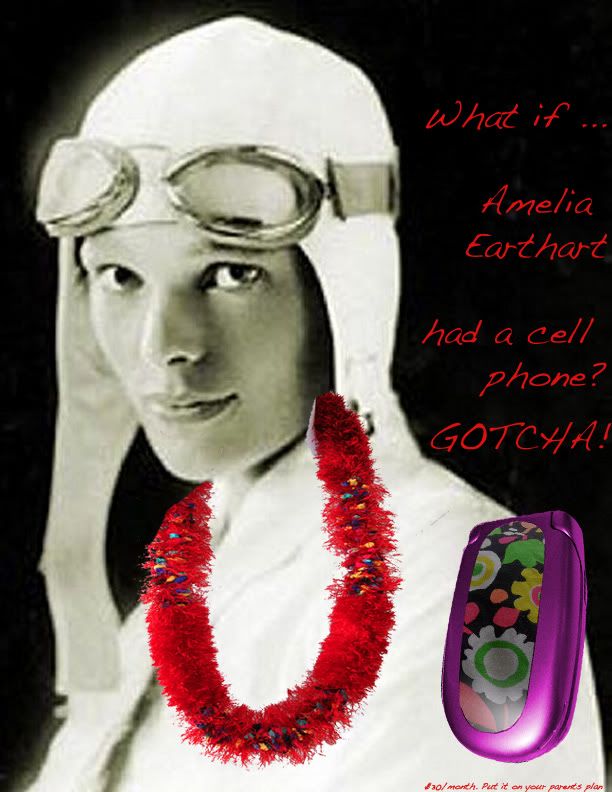


I think the problem with our campaign was that there was a lack of consistency throughout the ads. Another problem we ran into was how to transform the historical figures into something that a tween would think is funny. I liked the explorer theme and wish to continue down that path except this time i think it might be better if we created a narrative to entice the viewer. Stories are what makes the world interesting, and I think the single image with the line "what if _______ had a cell phone" could be taken a lot further. Perhaps dividing up the ad into small comic book like sections would break it up to allow your eyes to flow throughout the image instead of jumping around.
While the idea of this ad is great, it fails to carry out into an ad that is as strong as it is fully capable of becoming! I understand that this is our first time using photoshop, but the editing of the photos could have been done a little bit better-- mainly with the female ad. If it doesn't look right afterwards, just don't use it at all. Besides that I would just expand on a sense of humor that is more geared towards children and either make all of the photos in color or black and white. Overall, this is not a terrible concept, it just needs to be expanded upon:).
ReplyDeleteI believe that the characters used are very understandable for children. In fact, children could probably relate to the figures more than us because they are just learning about them in school.
ReplyDeleteIn addition, the words are a lot easier to see on a computer than the projector, but I think you should change the color of the words or give them a shadow or border.